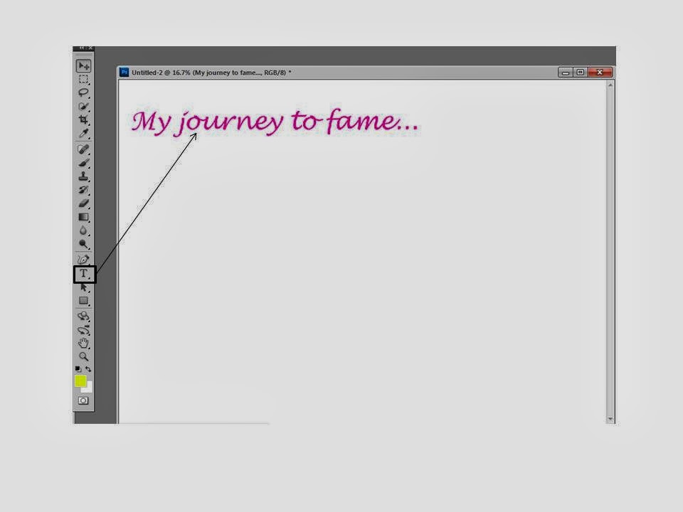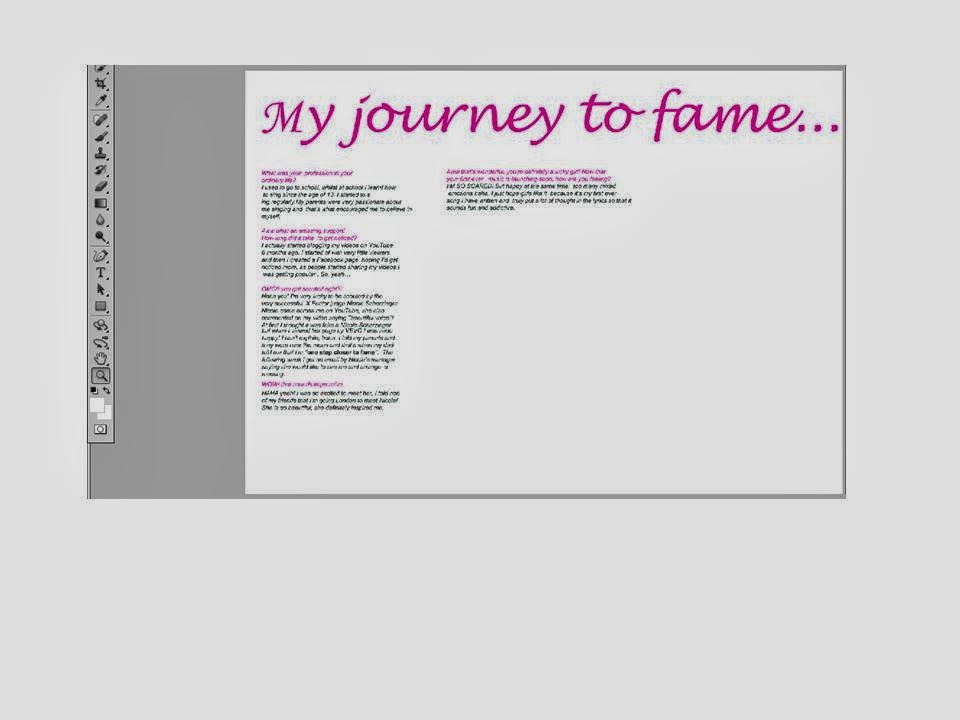
 I first set the page as A3 then placed my heading at the top using Lucida handwriting and used the conventional colour pink. Then I copied and pasted my text from my draft double page on publisher and layered it out in columns. Columns is a convention for a double page spread and and also questions in a different colour to the text makes it easier and precise for the readers.
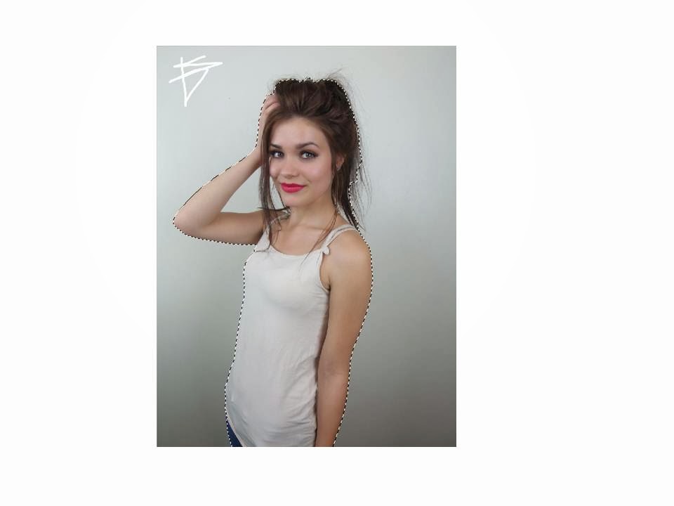
  Then used the quick selection tool to separate the object from the background, so it's easier for me rather than spending time erasing everything that's unnecessary.
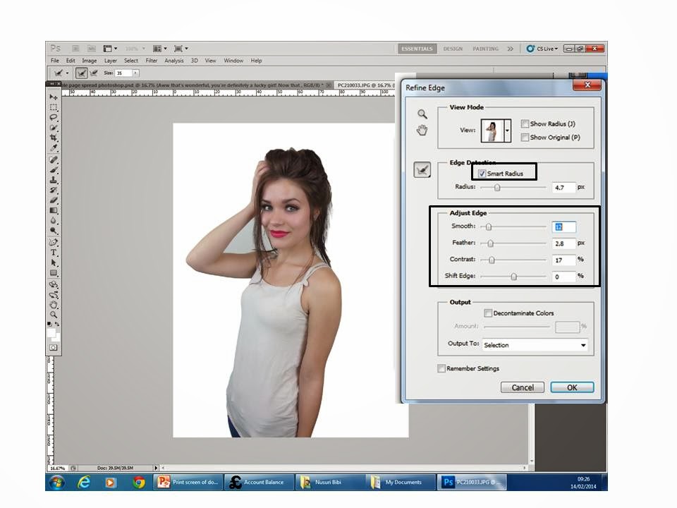
  To make the background look smooth I used the refine edge tool. This will make it look more professional and neat.
I then placed the edited picture on the right side of the page. This is conventional, this could be because when the audience flip through the page they'll notice the picture which should appeal to them to read the interview. I also put a background to the double page spread because it was very plain and boring. I used the gradient tool to make the background more effective. I also changed the font of the sub heading using 'dafont' online and stroked it black to appeal the readers. I then inserted the models name this was an inspiration from another magazine. I then conventionally put in page numbers using the black oval shape around it. And for the music notes I used the shape-custom tool to make it more interesting and fun.
Then I stroked the heading to stand out.

Then I used another oval shape for my pull quote and placed it in the middle. to make it effective I wrote ''omg'' to grab the readers attention.
Lastly I stroke the oval shape and the music notes and also added ''exclusive interview'' on the top right of the page.


No comments:
Post a Comment