Looking back at my preliminary task
I learnt how to edit codes and conventions using Photo shop and updating
everything on blogger. Using Photo shop is quite tricky because I felt like by
the time I would find the right tool to edit my front cover/contents/double
page spread it would be the end of lesson. However to save my time I would look
on You Tube in my spare time to learn how to edit certain things. In some cases
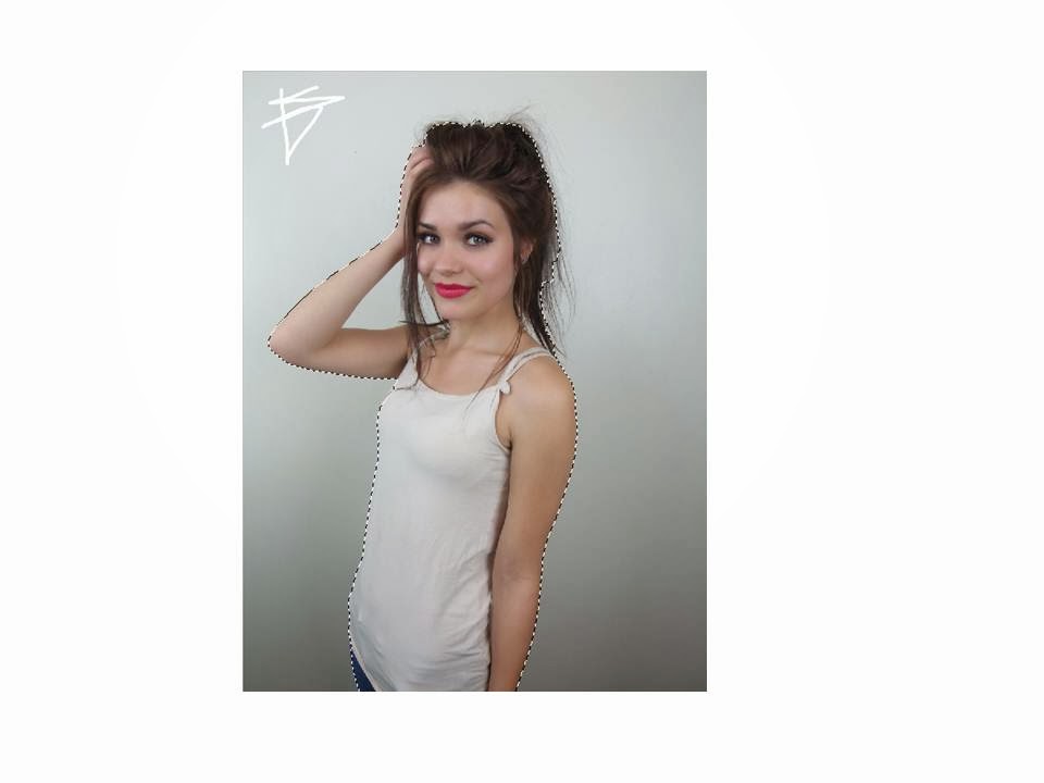
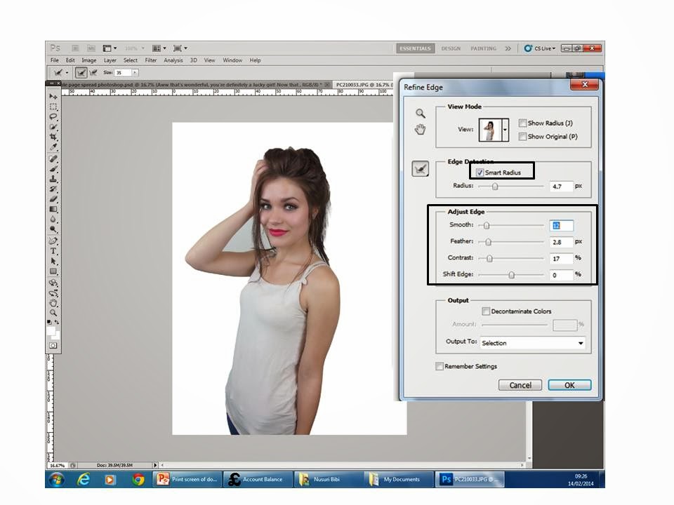
I found it useful e.g. using the quick eraser tool to crop the subject from the
background and placing in to another plain background. In my preliminary task I
didn’t quite like my college front cover as it’s very boring and not appealing.
I didn’t know how to edit pictures or use layers properly, if I could redo my
college front cover I would make it look more busy and interesting. In
my drafts I included all the conventions but it’s not full and the cover looks
simple. I kept the magazines traditional layout, I
also noticed that the music magazine Top Of The Pops had changed it’s front
cover layout as 2014 begun and they’re not using pink all the time to represent
the audience.
This table demonstrates what I have and what I haven't included in both of my magazine front covers


In my contents page I found it easy to create as I used the traditional layout from Top Of The Pops music magazine because firstly it’s conventional and secondly it’s interesting and fun. I also became familiar of all the important tools because I spent a lot of time on my front cover.
In
my double page spread I have learnt that you can’t create a double page spread
it has to be done on publisher because the text doesn’t wrap on Photo shop and
in some cases make the page look unconventional. By doing it on Publisher I got
to correct my grammar and spelling mistakes ,also wrapping the text around the pull quote ,this
technique makes the page look conventional.
If I could re do my college magazine I wouldn't change anything but I would add more sell lines make it look more appealing by adding shapes more pictures and edit the models picture and make it brighter or maybe put some neatural make up on to look healthy.
In my contents page I found it easy to create as I used the traditional layout from Top Of The Pops music magazine because firstly it’s conventional and secondly it’s interesting and fun. I also became familiar of all the important tools because I spent a lot of time on my front cover.


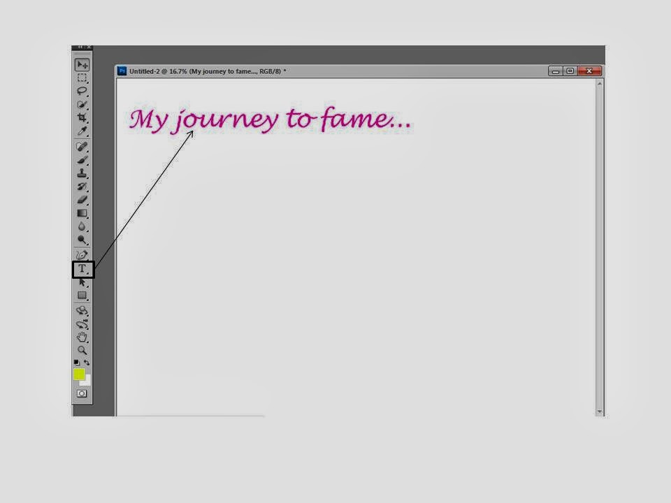
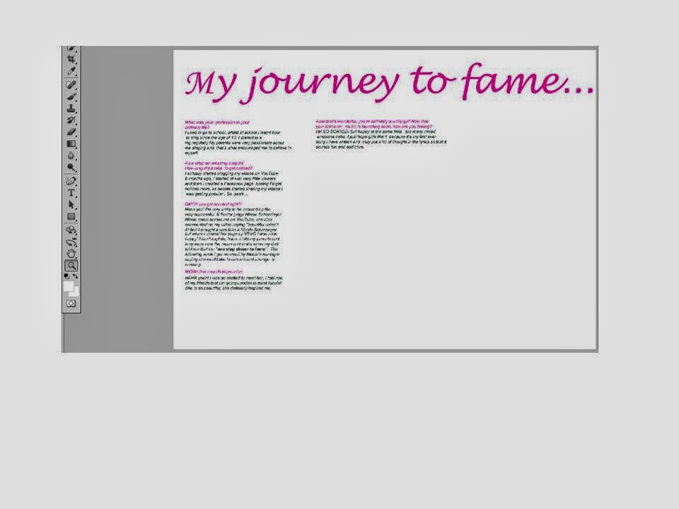 I first set the page as A3 then placed my heading at the top using Lucida handwriting and used the conventional colour pink. Then I copied and pasted my text from my draft double page on publisher and layered it out in columns. Columns is a convention for a double page spread and and also questions in a different colour to the text makes it easier and precise for the readers.