Wednesday 18 December 2013

This is a much more complete front cover. I kept all the conventions and just added the skyline, page numbers and price. I changed the fonts of the sell lines so its less boring and more handwritten to imply that the magazine is more diary like so that the readrers feel comfortable to read the magazine. The us of double explaination marks connotes more excitement and shocking. I also kept the page numbers beside the sell lines and it's conventional to be small and black font. The ''OMG'' is still the same but in bold to make it more dramatic. I moved the web address to the bottom and placed the price at the left top corner because it's cheap it's big and bold to appeal the audience to buy it because conventionally the price is £2.35-2.99. If I chose the price to be £2.35 it would be near the bar code. The tag line is now bold and in a serif font to tell the audience it's a magazine but not a simple and boring magazine. The sky line is in white sroked with black to give the connotations of importance the white connotes poisitivity and good music.
I changed the splash colour to pink because then it's consistant in colour it also matches the the masthead and that's imporatnt because Pop girl is promoting a new artist. The pull quote has been changed to a handwriting format however I couldn't do it black because it doesn't stand out because her jeans are black so I needed the pull quote to be bright as possible because it's this story that's interesting the audience to buy the magazine, I chose the quote to be ''How I became a star'' because it sounds influencial. The USP is smaller but the same and placed on the left side. I could add more sell lines and feature pictures to make it look more exciting and fun.

Tuesday 17 December 2013

Sample frame shots for draft music covers


These photos are for my first draft and I conventionally have done 3/4 frame shots leaving a bit of space at the top for my masthead.

This shot is a good medium close up, there's no shadows and he's making direct address to connote confidence.
In this frame the lighting is good. Pictures of boys is conventional for music magazines because boys attratct girls quicker.
This is a good posture as she is still making direct address and smiling. The lighting is also there's no shadows but her hair coukd have been more neater because it was hard to edit.
This shot is also a good photo however if her hair was a bit more neater so it would have been easier to edit.


This is a medium close up however there's shadow on her face
.

This is a good shot of her and a very conventional pose as her hands are on her hips. The lighting is good and also making direct address.

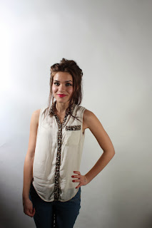
This picture is blurry and not good the lighting is wrong.

Analysis of the second draft

This is the second draft of my music cover.  I have included the basic conventions such as masthead, bar code, main image, USP,   pull quote and website address, however I haven't included skyline, price and date and other feature pictures therefore my cover looks incomplete and plain. For the main image it's 3/4 medium frame shot this is a conventional frame shots for nearly all music magazines this angle allows the audience to see the facial expression and their clothes. I have chosen a girl to feature my front cover because pop female singers represent younger female audience and therefore can relate to the audience. I could also have a male pop singer but he has to be young and good looking to appeal the audience. I ave also included the sell lines because they're conventional as it appeals the audience to buy the magazine to read more. For my masthead I have used the colour pink because stereotypically pink is a girls colour, the font looks like a hand writing and age appropriate. This font connotes bubbly and fun this creates an effect on the audience because it looks fun.  I have outlined the masthead to make it obvious and exciting, the stroke effect is also conventional but the stroke would be white to connote positivity and purity and not black. The masthead should also be behind her head because the main image is promoting the magazine and in that way the magazine becomes well known and popular.  The ''OMG'' effect inspired me from another pop magazine it's in caps and a shape to give the effect of importance and shocking. This word is abbreviated and matches young teen audience's dialect this is important because the audience feel relatable and comfortable to read the magazine because it's appropriate. The name of the artist is in a big font and outlined in black to keep the colour consistant. The pull quote is in pink but not appealing this has to be more bold and exciting because this is the main story for the magazine.  I need to include the price and date near the bar code, it's usually written in a shape to make it more clear but because it's expensive the price is little and un-noticeable.

Tuesday 3 December 2013

Top of Pops front cover analysis

LIIAR analysis of Pop music magazine


This magazine front cover is featured by Justin Beiber and this will apeal a lot of young girls becaus he has a lot of teen girl fans. The brightness of the cover is quite bright in colours, this connote that the magazine is fun and positive. The use of pink reflects on the audience as because the target audience are young girls and pink represents girls. However if there were different colours like green and brown, the cover wouldn't be so appealing as the colours are dull and boring and will give a different connotation about the magazine. This will also appeal to the audience because of the featured pictures of other young male celebrities and young popular female celebrities as because they've got a new show/songs or even gossip and advice.
The institutional logo is at the top left corner sponsored by BBC, this is conventional as so the audience know where it belongs and what type of magazine it is. the logo is always the same font so that the audience can recognise BBC. The target audience are young teenage girls from 14-19 but the statistics show that the younger audience from the age of 11 like to read Pop, this could be because as they're hitting puberty they feel quite insecure and different so they'd like advice from young female celebrities on how to style and to live a healthy lifestyle so that they can appeal to people. They could use young male celebrities to feature on the cover because young girls go through that phase of fancying good looking boys. The representation of the front cover is very clear as anyone would know who the magazine is targeted at because of the use of pink and pictures of girl clothes. without these pictures it would've been difficult to recognise the target audience.

Conventionally the front cover has a masthead, barcode, date, price, pull quote, sell lines, main image and feature images. Top of Pops also uses page numbers on the cover next to the topic to persuade the audience to buy the magazine and to to read more. The masthead is very bubbly and bold in pink with a white border to make it catchy, the masthead connotes fun and innocent. The main image of Justin... he's stood making direct address connoting confidence his smile is wide this will make the audience happy. The sell lines are in caps to make the magazine look busy and appealing also the font colours are pink and white this is keeping the theme consistant if it was multi coloured font it would give a different connotation and reflect on a much younger audience. I think if there wasn't a barcode the cover would look like a poster. The price and date is very important because the audience will know if it the magazine's old or new. Without these conventions the front cover wouldn't look so exciting and appealing.

Drafts and planning for my chosen genre Music magazine

This is sktecth of my models clothing, this is what i'd like to see and what other would like to see . They are skinny and healthy becuause it;s attractive in themedia and also a good inspiriation to younger kids. All of them are wearing white and elegant or sophisticated dress/skirts. Also hair down and smiling looking confident.

 fo                


This is my draft for the magazine front cover. I have included all the conventions such as masthead, USP, sky line, banner, main image, house of style, sell lines, bar code and date, price, page numbers, website, institutional logo and feature pictures. I decided to do pink because stereotypically it's a girls colour and it's also conventional. White also a conventional colour and blue because it's a nice contrast to the pink. In my main image I have planned for the model to wear a crop top and a skirt to connote confidence and summer/nice weather. She'll making dierctr address and smiling to connote happy.

For my contents I have followed the conventional layout of the magazine which has three columns and is categorised to make it easier for the readers to get around the magazine. The colours will be the same as the font cover.  

Monday 2 December 2013

Sample frame shots


This is a long shot and bad lighting, there's too much shadow. However this isn't a conventional frame shot for a front cover.
This is a medium close up. What a conventioanl photo looks like for a front cover, this frame allows the audience to see the face clearly and clothes. This also has good lighting.
This is a medium close up however teh light is in the wrong place creating shadows on her face which isn't professional.
This is also a medium close up but there's props in the frame which I should have been more aware of also the lighting doesn't look right.
For a group photo it's neccessary to position the people right within the frame, to get a equeal and clear view of everyone of them. This shot also allows us to apply a masthead above their heads because there's space. The lighting is also good no one has harsh shadows on their faces.
This shot is also a good photo however it would have been better if they were more closer or two of them at the back.
This shot could have been more closer but everything else is okay.