Friday 4 April 2014

Q1) In what ways does your media product use, develop or challenge forms and conventions of real media products?


In my front cover I copied the dialect such as "cute", "pics" and "OMG" to demonstrate friendliness  and fun. I then I put a picture in a box and put the sell line within it making it look conventional, this also makes it pop out and the white is good colour contrast towards the pink background. I then tried to copy the speech bubble that says "we love pop" this tells the audience that it's a pop magazine and makes the cover look interesting. The banner of the name is chunky and curly connoting a bubbly personality and the font's name called "ravie". The exclamation mark demonstrates loud and crazy.The world exclusive at the top tells the audience that it's a special interview that you wouldn't find anywhere else.  I also copied the font of "inside" but I put it at the bottom because of my skyline. 


In my contents page I used the traditional layout of the columns and pictures.  The arrows pointing at the page numbers demonstrate that those pages are must be read and the highlighted numbers makes demonstrates that it's important. At the top the title of the contents page is ''inside the mag'' it's free style hand writting this demonstrates how a girl would maybe write her wish list of what should be inside the mag. The title of page is also very conventional but unconventional too because it doesn't identify the contents page as contents, it's not a stereotypical contents page it doesn't list features and regulars. I included love hearts making it conventional and a fun way to categorise the magazine this also represents the young teen audience because usually they're in to flowers and hearts.
In my double page spread I also included all the conventions, I used a fancy font on my drop cap because it's very feminine. I used pink through out the magazine keeping it in continuity. The font of the models name is the same style as it was on the front cover. This demonstrates that Emily is the main story. The sub heading is in big speech marks this is a conventional way of making the page look fun. The music notes tells the audience that this article is about a singer. The pull quote is conventional as it appeals the readers eyes first so I stroked it black and filled it with hot pink demonstrating that this article is inspirational, the date and website is always highlighted because it's key information and lastly the page number is in semi colour filled with black, this makes it a conventional double page spread.

Thursday 3 April 2014

Q2) How does your media product represent particular social groups?


I have represented a particular social group as I made the model make direct address towards the camera to connote confidence, this will appeal the audience and make them feel welcomed.

 I wanted the model to wear a white dress because conventionally pop singers like Alexandra Burke and Cheryl Cole wore white dresses for Top Of The Pops music magazine to connote purity and innocence but my model wore a white vest instead.Which isn't a problem because looking casual makes the readers feel a bit comfortable rather than posh and I knew that you won't see her top because the front cover would be packed with with information and pictures.
 
Her hair style is very simple and easy just like how girls would have it normal day I noticed that Cheryl Cole and Alexandra Burke had their usual simple hairstyle. They also had simple make up on that made them look clean and happy rather than dark make up usually represents artists who do rock music perhaps and therefore I kept her make up natural with just false eyelash and pink lipstick. I chose the lipstick to be pink to contrast her white top and because it's a stereotypical colour that represents girls.
 
 
Conventionally male pop singers are the main attraction for female audiences in the magzine. This is because the male pop singers are opposite gender and naturally girls connect with them quicker. Male pop singers have 90% girl audience and therefore featuring a young male is important.

The posture of the male model connotes he's open and confident because his arms are behind him. he's also smiling and making direct address to connote he's happy and fun. The white top also conotes his innocence and purity and I chose it because his top will contrast the pink theme colour.
 

Friday 28 March 2014

Q5) How did you attract/address your audience?

In my Front cover I attracted/addressed my audience my audience through colours, pictures and style of language. In order to find out if I really attracted/addressed my audience I did a small questionnaire;

1)Can you tell the genre of the magazine I have produced?
2)Does my front cover, contents page and double page spread look conventional?
3)Do you think I have represented my audience through my design?, if so how?
4)What has appealed to you the most?
5)What is a good factor about my magazine?
6)Would you buy the magazine
7)How do you think I can improve it?

These questions allowed me to understand if I did attract or address my audience and from the feedback I know that I have because I got positive feedback on my house of style colour scheme and design. However I was told to improve on the models clothing which I agree with because it's very simple and not appealing.

I also attracted my audience by giving a free nail varnish "USP" because this represents my young audience as they're quite fashionable. This also makes the magazine expensive.


Part one of my audience feedback by nusuribibi on GoAnimate


Part 2 of my audience feedback by nusuribibi on GoAnimate

Thursday 27 March 2014

6) What have you learnt about technologies from the process of constructing this product?


I used this digital camera to take my photos for my magazine. The quality of this camera lens is very promising and good the picture is high pixelated so that I can edit it on photoshop. With this camera I used lighting so that the picture doesn't come out dark in the room.

Wednesday 26 March 2014

Q7) Looking back at your premilinary task, what do you think you have learnt in the progression from it to the full product?


Looking back at my preliminary task I learnt how to edit codes and conventions using Photo shop and updating everything on blogger. Using Photo shop is quite tricky because I felt like by the time I would find the right tool to edit my front cover/contents/double page spread it would be the end of lesson. However to save my time I would look on You Tube in my spare time to learn how to edit certain things. In some cases I found it useful e.g. using the quick eraser tool to crop the subject from the background and placing in to another plain background. In my preliminary task I didn’t quite like my college front cover as it’s very boring and not appealing. I didn’t know how to edit pictures or use layers properly, if I could redo my college front cover I would make it look more busy and interesting. In my drafts I included all the conventions but it’s not full and the cover looks simple.  I kept the magazines traditional layout, I also noticed that the music magazine Top Of The Pops had changed it’s front cover layout as 2014 begun and they’re not using pink all the time to represent the audience.

This table demonstrates what I have and what I haven't included in both of my magazine front covers
If I could re do my college magazine I wouldn't change anything but I would add more sell lines make it look more appealing by adding shapes more pictures and edit the models picture and make it brighter or maybe put some neatural make up on to look healthy.

In my contents page I found it easy to create as I used the traditional layout from Top Of The Pops music magazine because firstly it’s conventional and secondly it’s interesting and fun. I also became familiar of all the important tools because I spent a lot of time on my front cover.

In my double page spread I have learnt that you can’t create a double page spread it has to be done on publisher because the text doesn’t wrap on Photo shop and in some cases make the page look unconventional. By doing it on Publisher I got to correct my grammar and spelling mistakes ,also wrapping  the text around the pull quote ,this technique makes the page look conventional.

Friday 14 February 2014

Draft double page spread


Photo shop process of my double page spread draft


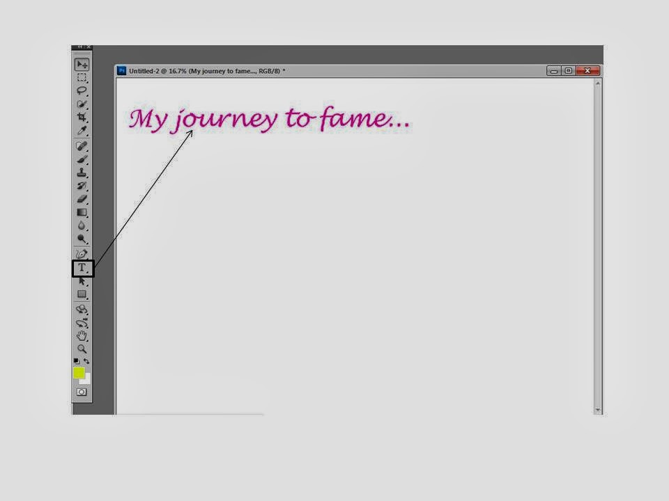
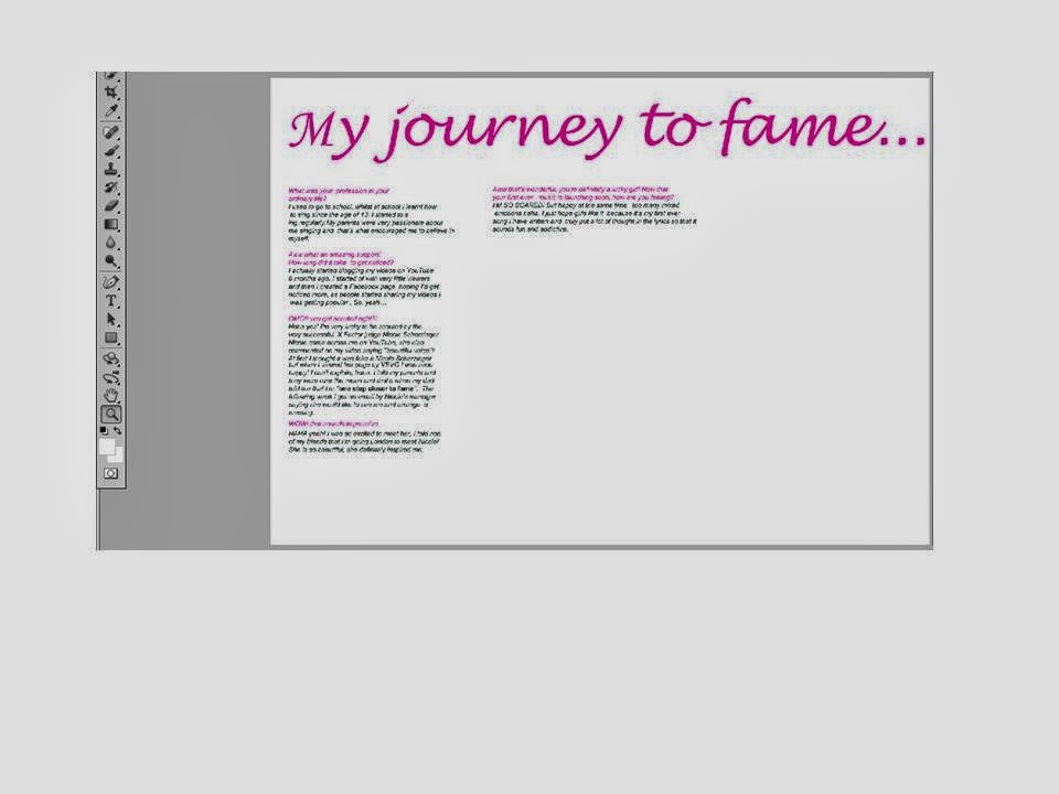
 I first set the page as A3 then placed my heading at the top using Lucida handwriting and used the conventional colour pink. Then I copied and pasted my text from my draft double page on publisher and layered it out in columns. Columns is a convention for a double page spread and and also questions in a different colour to the text makes it easier and precise for the readers. 


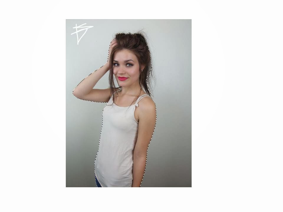
Then used the quick selection tool to separate the object from the background, so it's easier for me rather than spending time erasing everything that's unnecessary.


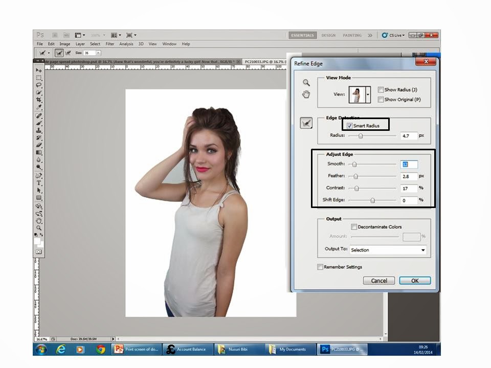
To make the background look smooth I used the  refine  edge tool. This will make it look more professional and neat.


 I then placed the edited picture on the right side of the page. This is conventional, this could be because when the audience flip through the page they'll notice the picture which should appeal to them to read the interview.  I also put a background to the double page spread because it was very  plain and boring. I used the gradient tool to make the background more effective.  I also changed the font of the sub heading using 'dafont' online and stroked it black to appeal the readers. I then inserted the models name this was an inspiration from another magazine. I then conventionally put in page numbers using the black oval shape around it. And for the music notes I used the shape-custom tool to make it more interesting and fun.


Then I stroked the heading to stand out.

Then I used another oval shape for my pull quote and placed it in the middle. to make it effective I wrote ''omg'' to grab the readers attention.
 

Lastly I stroke the oval shape and the music notes and also added ''exclusive interview'' on the top right of the page.


 After finding out that I can't text wrap around the pull quote in Photo Shop I was told to do my double page spread on Publisher. I deleted the text and saved the shape and the pull quote as a picture, I then changed the font of 'emily' and the subheading to the same font as it was on the front cover to keep the continuity and added speech marks to make it look conventional I also changed the brightness of the image to make it look more attractive and not cheap, after that I saved the double page spread as JPEG and used it as my background on publisher. I then put my text and pull quote in using columns. I also put a drop cap in and put a caption of the image at the bottom of the page alongside the website and date that's highlighted at the bottom in pink.

Tuesday 11 February 2014

Constructing the contents page

At first I used the rectangle tool to use a background for my contents title this is a conventional technique in a pop magazine and I filled it with pink which is another conventional colour and also would make the contents title stand out from the informational page. I then put the title in and used a font similar to the actual font in the contents page because I couldn't find the exact font I ended up using 'Lucida handwriting' italic, and 60pt.

I then created 3 columns using the rectangular tool, conventionally there's 4 but there's not enough space. I also put effects on top of the columns because its conventional and it makes the columns noticeable. The ombre colours in the columns called ''gradient overlay''.

Then I added the page number by adding another shape to make the page numbers noticable. I numbered the page 3 because when you open the magazine there's adverts then contents page.

To create the shape at the bottom of the page for my page number I used an oval shape and filled it with black. This makes it very similar to the conetnts page from a pop magazine.


 I then used another rectangle white shape stroked it with yellow and put the subheading in with a love heart.

Thursday 6 February 2014

Double page draft


I created this draft on words because it's easier to create a double page and include all the conventions. I added all the conventions like image, page numbers, pull quote, text, columns, heading, and a sub heading. I kept the colours consistent and the model to make my front cover, contents and double page all look like they belong together. I put th equestions in pink to make it easier for the readers and used teenagers dialect to make the readers feel comforatble. However if I do it on photoshop I could change the background and add shapes and other features to appeal the readers. I would also change the models posture so that the picture almost uses two pages to make it look professional.

Constructing my contents page


To create my contents page I used the conventional layout to set out my contents. I used highlights to make it seem important to the readers. The contents page also features the front cover and feature pictures and other information. I also kept the house of style colours consistent to make it look professional.

1) I added the conventional title 'inside the mag' with a pink border behind it. I also started to add columns with a gradient filled shape at the top for the subheading. Then I wrote 'we [heart] fashion), the love heart also features on the professional magazine, this could be to make the page look interesting. Lastly I put the page number in with a semi circle shape at the back and the font colour white, this is a conventional style of writing the page number and the contents page is on the third page because there would be adverts at the front just after the front cover.
2)I put the front cover in and placed it at the top left corner.
3)I put in more subheadings with a white background  shape behind the text and stroked to make it look neat and professional. I also put in big page numbers beside the magazine.I also added a picture of the young boy in the bottom right corner this is conventional for the contents page
4)I started highlighting the page numbers to make it noticeable for the audience also to connote it's important. I also put in a picture of an outfit because pop magazine also talks about fashion.
5)I filled the columns with text and highlighted the important pages.


I took some advice and started to make my contents page look more conventional so I added arrows, made sure I had 4 columns and adjusted the picture at the bottom making it brighter so that the image looks appropriately professional and not cheap.