
Friday 14 February 2014
Photo shop process of my double page spread draft
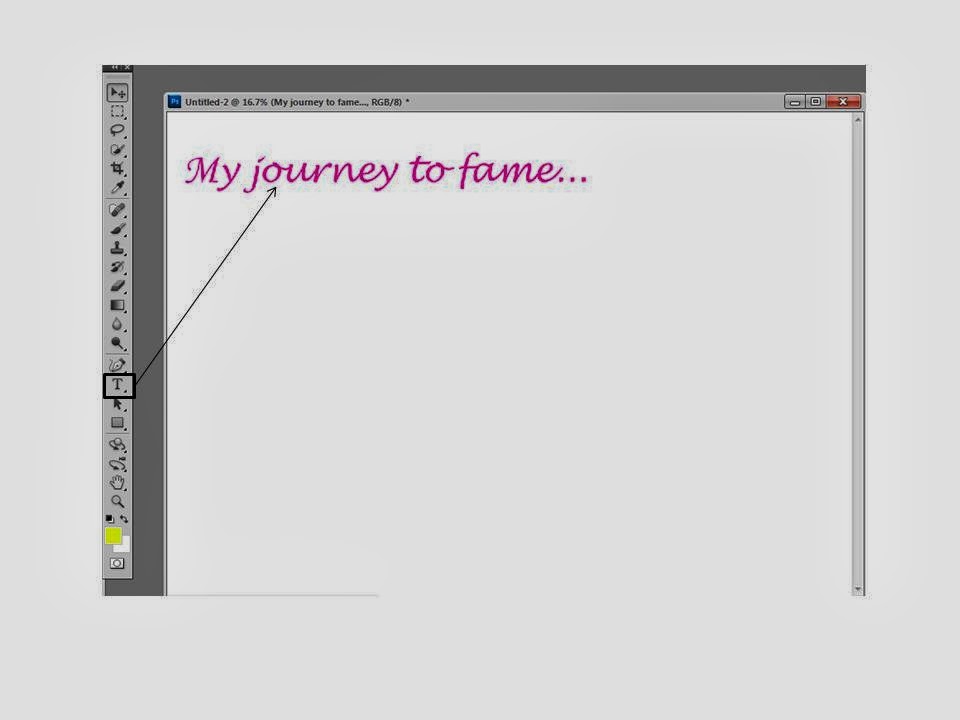
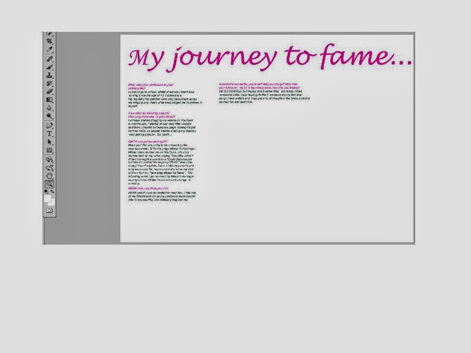 I first set the page as A3 then placed my heading at the top using Lucida handwriting and used the conventional colour pink. Then I copied and pasted my text from my draft double page on publisher and layered it out in columns. Columns is a convention for a double page spread and and also questions in a different colour to the text makes it easier and precise for the readers.
 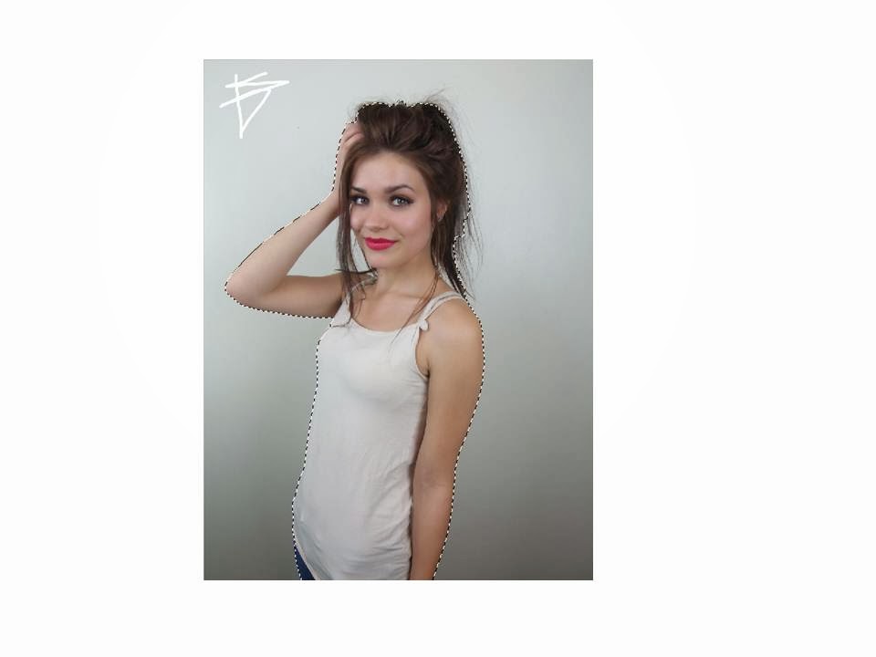 Then used the quick selection tool to separate the object from the background, so it's easier for me rather than spending time erasing everything that's unnecessary.
 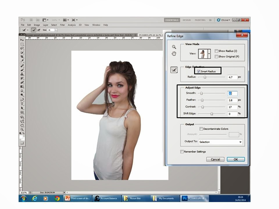 To make the background look smooth I used the refine edge tool. This will make it look more professional and neat.
I then placed the edited picture on the right side of the page. This is conventional, this could be because when the audience flip through the page they'll notice the picture which should appeal to them to read the interview. I also put a background to the double page spread because it was very plain and boring. I used the gradient tool to make the background more effective. I also changed the font of the sub heading using 'dafont' online and stroked it black to appeal the readers. I then inserted the models name this was an inspiration from another magazine. I then conventionally put in page numbers using the black oval shape around it. And for the music notes I used the shape-custom tool to make it more interesting and fun.


Then I stroked the heading to stand out.

Then I used another oval shape for my pull quote and placed it in the middle. to make it effective I wrote ''omg'' to grab the readers attention.


Tuesday 11 February 2014
Constructing the contents page


I then created 3 columns using the rectangular tool, conventionally there's 4 but there's not enough space. I also put effects on top of the columns because its conventional and it makes the columns noticeable. The ombre colours in the columns called ''gradient overlay''.
Then I added the page number by adding another shape to make the page numbers noticable. I numbered the page 3 because when you open the magazine there's adverts then contents page.

To create the shape at the bottom of the page for my page number I used an oval shape and filled it with black. This makes it very similar to the conetnts page from a pop magazine.

 I then used another rectangle white shape stroked it with yellow and put the subheading in with a love heart.
Thursday 6 February 2014
Double page draft

I created this draft on words because it's easier to create a double page and include all the conventions. I added all the conventions like image, page numbers, pull quote, text, columns, heading, and a sub heading. I kept the colours consistent and the model to make my front cover, contents and double page all look like they belong together. I put th equestions in pink to make it easier for the readers and used teenagers dialect to make the readers feel comforatble. However if I do it on photoshop I could change the background and add shapes and other features to appeal the readers. I would also change the models posture so that the picture almost uses two pages to make it look professional.
Constructing my contents page

To create my contents page I used the conventional layout to set out my contents. I used highlights to make it seem important to the readers. The contents page also features the front cover and feature pictures and other information. I also kept the house of style colours consistent to make it look professional.
1) I added the conventional title 'inside the mag' with a pink border behind it. I also started to add columns with a gradient filled shape at the top for the subheading. Then I wrote 'we [heart] fashion), the love heart also features on the professional magazine, this could be to make the page look interesting. Lastly I put the page number in with a semi circle shape at the back and the font colour white, this is a conventional style of writing the page number and the contents page is on the third page because there would be adverts at the front just after the front cover.
2)I put the front cover in and placed it at the top left corner.
3)I put in more subheadings with a white background shape behind the text and stroked to make it look neat and professional. I also put in big page numbers beside the magazine.I also added a picture of the young boy in the bottom right corner this is conventional for the contents page
4)I started highlighting the page numbers to make it noticeable for the audience also to connote it's important. I also put in a picture of an outfit because pop magazine also talks about fashion.
5)I filled the columns with text and highlighted the important pages.
I took some advice and started to make my contents page look more conventional so I added arrows, made sure I had 4 columns and adjusted the picture at the bottom making it brighter so that the image looks appropriately professional and not cheap.


Wednesday 5 February 2014
Social class and demographics...
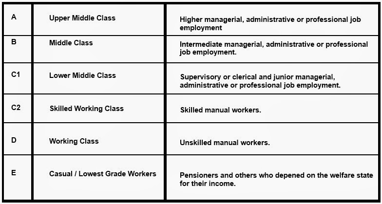 Social class
 After my research I decided to choose the price as £1 because my young audiences are casual lowest grade workers, as they're not working and usually living off their parents for their welfare. Therefor, it would make it easier for my young audience to purchase my magazine. This price also made me decided that the celebrity that is featuring on my magazine isn't very popular yet... so my chosen price would help convince my audience to buy my magazine. However if Vogue magazines costs £4.10 my young audience would not have been able to purchase the magazine because it's expensive. This magazine would be bought by C1/C2 audiences as it could be affordable for them. Moreover the Vogue magazine is aimed at a older female audience . Since my audience are at a stage in life were they're learning how to dress up and be trendy, I decided to give free gifts like nail varnish in that way the make up brand would be promoted.
Demographics
Conventionally the target audience for pop magazines are from the age of 12-15 but because nowadays everyone is so advanced in lifestyle, pop magazines could also be bought by 10 year olds and onwards. Stereotypically pop magazines are designed for girls, however statistics show that 85% of girls read pop and 15% of boys read pop too. The race of my audiences would be 50% English/American, 30% black and 10% Asian and 10% European. In order to read my magazine it's important to have education also the dialect on my magazine is going to be abbreviated/everyday words from typical teenagers, the dialect will relate to my audience. However, too formal/big words won't be familiar to the audiences.
Tuesday 4 February 2014
Questionnaire for my music magazine
Questionnaire for music magazine
Could you
please take some time out to answer the following the questions…
(PLEASE
CIRCLE the optional answers given)
1) Gender M/ F
2) Age 10-13
14-17 18-21 22+
3) What types of music magazines do you
like reading? (tick the following)
·
Pop
·
Rock
·
Indie
·
R&B
4) What do you like about the chosen
music magazine?
5) How much do you
spend on music magazines on average?
£1-£2 £3-£4
£5+
6) What else would you like to see in music
magazines?
7) What don’t you like about the other
music magazines?
Thank you
for your time, much appreciated.
Sunday 2 February 2014

Subscribe to:
Posts (Atom)